pacman::p_load(ggiraph, plotly, patchwork, DT, tidyverse) Hands-on Exercise 3.1: Programming Interactive Data Visualisation with R
1 Getting Started
1.1 Install and loading R packages.
The code chunk below uses p_load() of pacman package to check if packages are installed in the computer. If they are, then they will be launched into R.
ggiraph for making ‘ggplot’ graphics interactive.
plotly, R library for plotting interactive statistical graphs.
DT provides an R interface to the JavaScript library DataTables that create interactive table on html page.
tidyverse, a family of modern R packages specially designed to support data science, analysis and communication task including creating static statistical graphs.
patchwork for combining multiple ggplot2 graphs into one figure.
1.2 Importing the data
exam_data <- read_csv("../../data/Exam_data.csv")2 Interactive Data Visualisation - ggiraph methods
2.1 Tooltip effect with tooltip aesthetic
Below shows a typical code chunk to plot an interactive statistical graph by using ggiraph package.
Notice that the code chunk consists of two parts.
First, an ggplot object will be created.
Next, girafe() of ggiraph will be used to create an interactive svg object.
Click to view the code.
p <- ggplot(data=exam_data,
       aes(x = MATHS)) +
  geom_dotplot_interactive(
    aes(tooltip = ID),
    stackgroups = TRUE,
    binwidth = 1,
    method = "histodot") +
  scale_y_continuous(NULL,
                     breaks = NULL)
girafe(
  ggobj = p,
  width_svg = 6,
  height_svg = 6*0.618
)
3 Interactivity
3.1 Displaying multiple information on tooltip
The content of the tooltip can be customised by including a list object as shown in the code chunk below.
Click to view the code.
exam_data$tooltip <- c(paste0(
  "Name = ", exam_data$ID,
  "\n Class = ", exam_data$CLASS))

p <- ggplot(data=exam_data,
       aes(x = MATHS)) +
  geom_dotplot_interactive(
    aes(tooltip = exam_data$tooltip),
    stackgroups = TRUE,
    binwidth = 1,
    method = "histodot") +
  scale_y_continuous(NULL,
                     breaks = NULL)
girafe(
  ggobj = p,
  width_svg = 8,
  height_svg = 8*0.618
)
4 Interactivity - Advanced
By hovering the mouse pointer on an data point of interest, the student’s ID and Class will be displayed.
4.1 Customising Tooltip style
Code chunk below uses opts_tooltip() of ggiraph to customize tooltip rendering by add css declarations.
Notice that the background colour of the tooltip is black and the font colour is white and bold.
Click to view the code.
tooltip_css <- "background-color:white; #<<
font-style:bold; color:black;" #<<

p <- ggplot(data=exam_data,
       aes(x = MATHS)) +
  geom_dotplot_interactive(
    aes(tooltip = ID),
    stackgroups = TRUE,
    binwidth = 1,
    method = "histodot") +
  scale_y_continuous(NULL,
                     breaks = NULL)
girafe(
  ggobj = p,
  width_svg = 6,
  height_svg = 6*0.618,
  options = list(    #<<
    opts_tooltip(    #<<
      css = tooltip_css)) #<<
)
4.2 Displaying statistics on tooltip
Code chunk below shows an advanced way to customise tooltip. In this example, a function is used to compute 90% confident interval of the mean. The derived statistics are then displayed in the tooltip.
Click to view the code.
tooltip <- function(y, ymax, accuracy = .01) {
  mean <- scales::number(y, accuracy = accuracy)
  sem <- scales::number(ymax - y, accuracy = accuracy)
  paste("Mean maths scores:", mean, "+/-", sem)
}

gg_point <- ggplot(data=exam_data,
                   aes(x = RACE),
) +
  stat_summary(aes(y = MATHS,
                   tooltip = after_stat(
                     tooltip(y, ymax))),
    fun.data = "mean_se",
    geom = GeomInteractiveCol,
    fill = "light blue"
  ) +
  stat_summary(aes(y = MATHS),
    fun.data = mean_se,
    geom = "errorbar", width = 0.2, size = 0.2
  )

girafe(ggobj = gg_point,
       width_svg = 8,
       height_svg = 8*0.618)
4.3 Hover effect with data_id aesthetic
Code chunk below shows the second interactive feature of ggiraph, namely data_id.
Interactivity: Elements associated with a data_id (i.e CLASS) will be highlighted upon mouse over.
Note that the default value of the hover css is hover_css = “fill:orange;”.
Click to view the code.
p <- ggplot(data=exam_data,
       aes(x = MATHS)) +
  geom_dotplot_interactive(
    aes(data_id = CLASS, tooltip = ID),
    stackgroups = TRUE,
    binwidth = 1,
    method = "histodot") +
  scale_y_continuous(NULL,
                     breaks = NULL)
girafe(
  ggobj = p,
  width_svg = 6,
  height_svg = 6*0.618
)
4.4 Styling hover effect
In the code chunk below, css codes are used to change the highlighting effect.
Interactivity: Elements associated with a data_id (i.e CLASS) will be highlighted upon mouse over.
Note: Different from previous example, in this example the ccs customisation request are encoded directly.
Click to view the code.
p <- ggplot(data=exam_data,
       aes(x = MATHS)) +
  geom_dotplot_interactive(
    aes(data_id = CLASS),
    stackgroups = TRUE,
    binwidth = 1,
    method = "histodot") +
  scale_y_continuous(NULL,
                     breaks = NULL)
girafe(
  ggobj = p,
  width_svg = 6,
  height_svg = 6*0.618,
  options = list(
    opts_hover(css = "fill: #202020;"),
    opts_hover_inv(css = "opacity:0.2;")
  )
)
4.5 Combining tooltip and hover effect
There are time that we want to combine tooltip and hover effect on the interactive statistical graph as shown in the code chunk below.
Interactivity: Elements associated with a data_id (i.e CLASS) will be highlighted upon mouse over. At the same time, the tooltip will show the CLASS.
Click to view the code.
p <- ggplot(data=exam_data,
       aes(x = MATHS)) +
  geom_dotplot_interactive(
    aes(tooltip = CLASS,
        data_id = CLASS),
    stackgroups = TRUE,
    binwidth = 1,
    method = "histodot") +
  scale_y_continuous(NULL,
                     breaks = NULL)
girafe(
  ggobj = p,
  width_svg = 6,
  height_svg = 6*0.618,
  options = list(
    opts_hover(css = "fill: #202020;"),
    opts_hover_inv(css = "opacity:0.2;")
  )
)
4.6 Click effect with onclick
onclick argument of ggiraph provides hotlink interactivity on the web.
The code chunk below shown an example of onclick.
Interactivity: Web document link with a data object will be displayed on the web browser upon mouse click.
Click to view the code.
exam_data$onclick <- sprintf("window.open(\"%s%s\")",
"https://www.moe.gov.sg/schoolfinder?journey=Primary%20school",
as.character(exam_data$ID))

p <- ggplot(data=exam_data,
       aes(x = MATHS)) +
  geom_dotplot_interactive(
    aes(onclick = onclick),
    stackgroups = TRUE,
    binwidth = 1,
    method = "histodot") +
  scale_y_continuous(NULL,
                     breaks = NULL)
girafe(
  ggobj = p,
  width_svg = 6,
  height_svg = 6*0.618)
4.7 Coordinated Multiple Views with ggiraph
Coordinated multiple views methods has been implemented in the data visualisation below.
Notice that when a data point of one of the dotplot is selected, the corresponding data point ID on the second data visualisation will be highlighted too.
In order to build a coordinated multiple views as shown in the example above, the following programming strategy will be used:
Appropriate interactive functions of ggiraph will be used to create the multiple views. patchwork function of patchwork package will be used inside girafe function to create the interactive coordinated multiple views.
The data_id aesthetic is critical to link observations between plots and the tooltip aesthetic is optional but nice to have when mouse over a point.
Click to view the code.
p1 <- ggplot(data=exam_data,
aes(x = MATHS)) +
geom_dotplot_interactive(
aes(data_id = ID),
stackgroups = TRUE,
binwidth = 1,
method = "histodot") +
coord_cartesian(xlim=c(0,100)) +
scale_y_continuous(NULL,
breaks = NULL)
p2 <- ggplot(data=exam_data,
aes(x = ENGLISH)) +
geom_dotplot_interactive(
aes(data_id = ID),
stackgroups = TRUE,
binwidth = 1,
method = "histodot") +
coord_cartesian(xlim=c(0,100)) +
scale_y_continuous(NULL,
breaks = NULL)
girafe(code = print(p1 + p2),
width_svg = 6,
height_svg = 3,
options = list(
opts_hover(css = "fill: #202020;"),
opts_hover_inv(css = "opacity:0.2;")
)
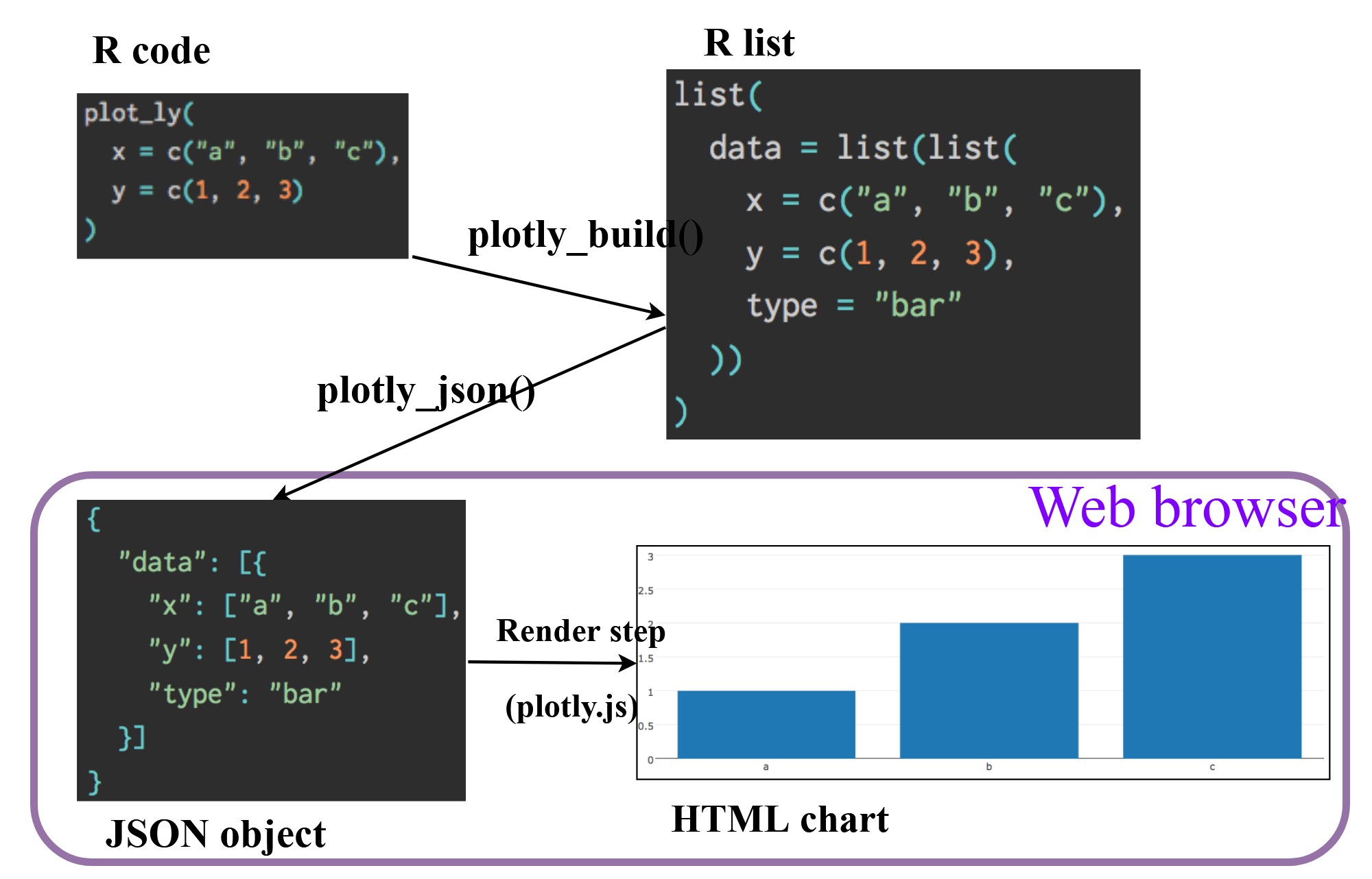
) 5 Interactive Data Visualisation - plotly methods!
Plotly’s R graphing library create interactive web graphics from ggplot2 graphs and/or a custom interface to the (MIT-licensed) JavaScript library plotly.js inspired by the grammar of graphics. Different from other plotly platform, plot.R is free and open source.
There are two ways to create interactive graph by using plotly, they are:
by using plot_ly(), and
by using ggplotly()
5.1 Creating an interactive scatter plot: plot_ly() method
The tabset below shows an example a basic interactive plot created by using plot_ly().
Click to view the code.
plot_ly(data = exam_data,
             x = ~MATHS,
             y = ~ENGLISH)
5.2 Working with visual variable: plot_ly() method
In the code chunk below, color argument is mapped to a qualitative visual variable (i.e. RACE).
Click to view the code.
plot_ly(data = exam_data,
        x = ~ENGLISH,
        y = ~MATHS,
        color = ~RACE)
5.3 Creating an interactive scatter plot: ggplotly() method
The code chunk below plots an interactive scatter plot by using ggplotly().
Notice that the only extra line you need to include in the code chunk is ggplotly().
5.4 Coordinated Multiple Views with plotly
The creation of a coordinated linked plot by using plotly involves three steps:
highlight_key() of plotly package is used as shared data.
two scatterplots will be created by using ggplot2 functions.
lastly, subplot() of plotly package is used to place them next to each other side-by-side.
Click on a data point of one of the scatterplot and see how the corresponding point on the other scatterplot is selected.
Thing to learn from the code chunk:
highlight_key() simply creates an object of class crosstalk::SharedData.
Click to view the code.
d <- highlight_key(exam_data)
p1 <- ggplot(data=d,
            aes(x = MATHS,
                y = ENGLISH)) +
  geom_point(size=1) +
  coord_cartesian(xlim=c(0,100),
                  ylim=c(0,100))

p2 <- ggplot(data=d,
            aes(x = MATHS,
                y = SCIENCE)) +
  geom_point(size=1) +
  coord_cartesian(xlim=c(0,100),
                  ylim=c(0,100))
subplot(ggplotly(p1),
        ggplotly(p2))
6 Interactive Data Visualisation - crosstalk methods!
Crosstalk is an add-on to the htmlwidgets package. It extends htmlwidgets with a set of classes, functions, and conventions for implementing cross-widget interactions (currently, linked brushing and filtering).
6.1 Interactive Data Table: DT package
A wrapper of the JavaScript Library DataTables
Data objects in R can be rendered as HTML tables using the JavaScript library ‘DataTables’ (typically via R Markdown or Shiny).
DT::datatable(exam_data, class= "compact")6.2 Linked brushing: crosstalk method
highlight()is a function of plotly package. It sets a variety of options for brushing (i.e., highlighting) multiple plots. These options are primarily designed for linking multiple plotly graphs, and may not behave as expected when linking plotly to another htmlwidget package via crosstalk. In some cases, other htmlwidgets will respect these options, such as persistent selection in leaflet.bscols()is a helper function of crosstalk package. It makes it easy to put HTML elements side by side. It can be called directly from the console but is especially designed to work in an R Markdown document. Warning: This will bring in all of Bootstrap!.