pacman::p_load(ggHoriPlot, ggthemes, tidyverse)In-class Exercise 6: Visualising and Analysing Time-Oriented Data
View the slides to learn more about:
Characteristics of time-series data
A short visual history of time-series graphs
Time-series patterns
-
Time-series data visualization Methods
- Line graph
- Control chart
- Slopegraph
- Cycle plot
- Horizon graph
- Sunburst diagram
- Calendar Heatmap
- Stream Graph
Interactive techniques for time-series data visualisation
Animation techniques for time-series visualisation
1 Tableau
Visitor arrival by country
Click here to view more.
2 Hirizon Plot
2.1 Loading R Package
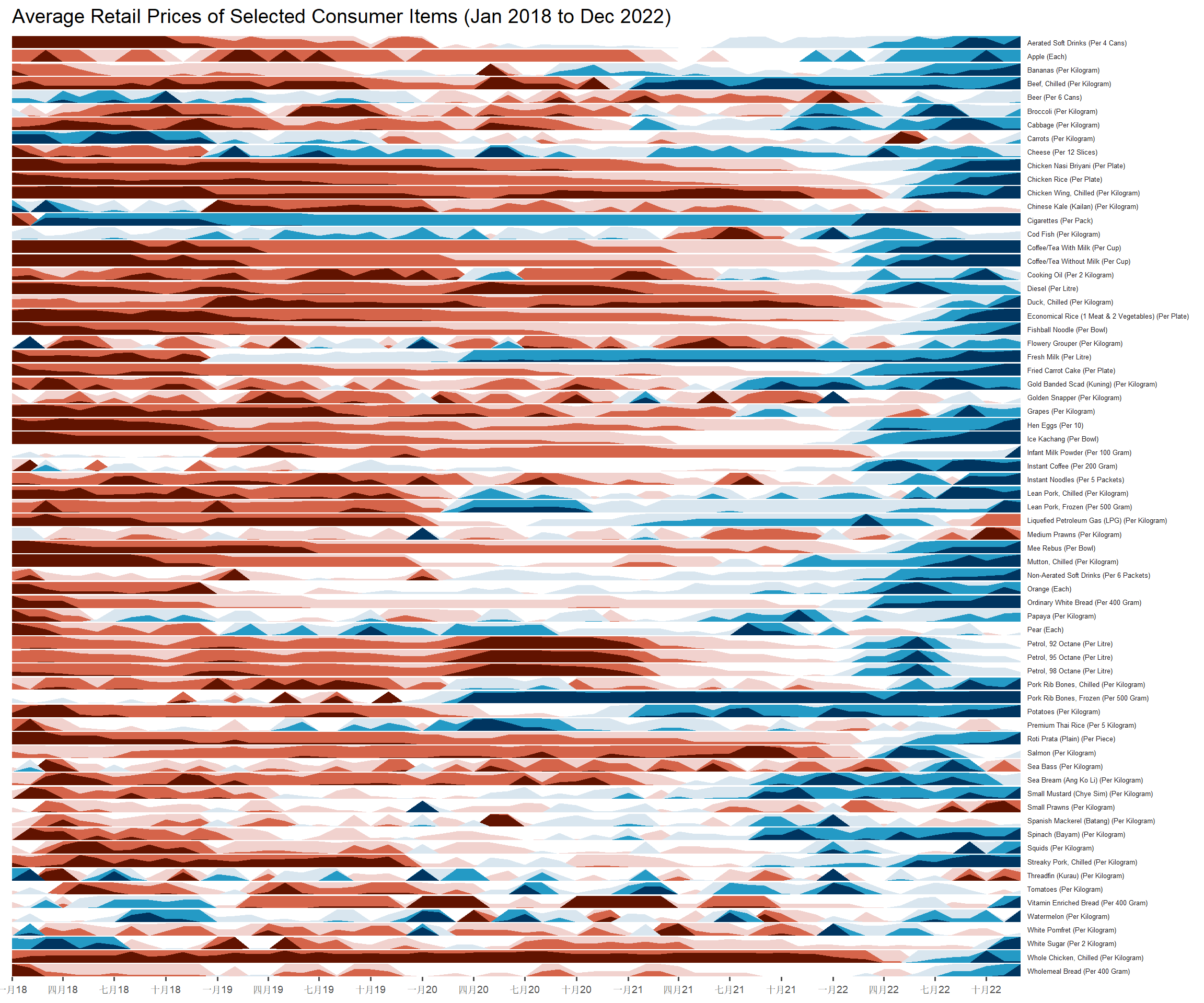
2.2 Dataset
averp <- read_csv("../../data/AVERP.csv") %>%
  mutate(`Date` = dmy(`Date`))
Click here to view the code.
averp %>%
  filter(Date >= "2018-01-01") %>%
  ggplot() +
  geom_horizon(aes(x = Date, y=Values),
               origin = "midpoint",
               horizonscale = 6)+
  facet_grid(`Consumer Items`~.) +
    theme_few() +
  scale_fill_hcl(palette = 'RdBu') +
  theme(panel.spacing.y=unit(0, "lines"), strip.text.y = element_text(
    size = 5, angle = 0, hjust = 0),
    legend.position = 'none',
    axis.text.y = element_blank(),
    axis.text.x = element_text(size=7),
    axis.title.y = element_blank(),
    axis.title.x = element_blank(),
    axis.ticks.y = element_blank(),
    panel.border = element_blank()
    ) +
    scale_x_date(expand=c(0,0), date_breaks = "3 month", date_labels = "%b%y") +
  ggtitle('Average Retail Prices of Selected Consumer Items (Jan 2018 to Dec 2022)')